This post goes into the technical details of how Peak was made. You can also read the story behind the app and download it on the App Store.
The Stack
Peak started out as a nights and weekends project. I knew that time was going to be short at hand, and that having some momentum and being able to make tangible changes in the short bursts of time I could scrounge together was going to be critical to keeping the project alive, and all that made the choice of tech stack fairly straightforward: SwiftUI and The Composable Architecture.
I was familiar with both from using them at my job at the time, and I knew that while there’s a bit of boilerplate involved with TCA, the productivity gains over time made it worth it. While SwiftUI is great for quickly building and iterating on interfaces, there’s still all the business logic and data flow that you need to sort out yourself. It’s the combination of the two that truly makes my brain go almost on autopilot and quickly hammer out whole new features.
I hope to write more in detail about my experience using both of these frameworks, but for now, know that I don’t exaggerate when I say that without them, this app likely wouldn’t exist right now, let alone be on the App Store, and that too in a state that I can genuinely be proud of.
My deepest appreciation and thanks go out to everyone involved in making and maintaining them.
Design
The design goal for the app was for something that felt at home on iOS, while still not feeling too cookie cutter. I didn’t want the app to feel as extremely stock as SwiftUI apps are often (correctly) accused of being1.
Another important design goal was theming. I didn’t want this app to have just a light and dark theme, or even just simple customisations such as an accent colour, but instead just entirely different, vibrant themes. This bit was made fairly simple by making themes available via an the Environment in SwiftUI, which propagates values across the hierarchy, while also allowing for overrides at any point.
Controls
Keeping with the design brief, there’s a fair mix of stock and custom UI in the app. In general I leaned towards stock UI where I could, but didn’t really hesitate too much to build something anew where I had to. In UIKit land the accessibility regressions and additional maintenance involved would make me a lot more hesitant, but the story around both those aspects is a lot better in SwiftUI.
The charts are all rendered using the Swift Charts framework, which was a fortuitous little surprise at WWDC last year as I’d spent just the previous trying to figure out how to make my own.
Apple offers a UIKit component to render activity rings, however it’s a bit inflexible. It can only be populated with data from HealthKit, the animation timing is controlled by the system, and you can’t change any of the colours. I’ve previously recreated the rings in SpriteKit so I had a general idea of how to go about it, and I’m happy to say remaking them in SwiftUI was quite a bit simpler.
All forms, such as the ones you see in Settings, or when you add metrics in onboarding, are custom. I tried using the standard List and Form components but wasn’t able to sufficiently customise them to fit the aesthetic I had in mind, so I ended up making my own set of controls, creatively called Mesa (Spanish for “table”). I really hope the system APIs are opened up more in the future to allow for more customisation, because you do miss out on a lot of built in niceties such as edit mode, swipe actions, and more, when you choose to build something using a LazyVStack instead.
Party Tricks
Whenever I’m designing an app, I’m on the lookout for places to add fun little homages to interfaces I’ve been inspired by over the years.
With Pause, I recreated the classic macOS genie effect. Here, I stumbled upon an opportunity to add not one but two, in one go.
I needed some way to let people reorder their metrics and blocks, and drag and drop was clearly the ideal interaction here. The app also includes interactive charts where you can tap or swipe on them to see the values over time, and the use of similar gestures made both of these interactions finicky. It was clear that they had to be exclusive, and so I needed an explicit edit mode. And what better inspiration for edit mode than Springboard’s jiggle mode.
Getting SwiftUI to render it all correctly took a bit of effort, but it ended up being surprisingly simple to set up.
One little additional touch is that when you exit enter mode, the metrics or blocks don’t snap to the regular state, but instead gracefully complete their current jiggle and stop when they reach the resting position. This behaviour was more difficult to get right, because I wanted the animation’s actual state to be based off of both an external state and a timer of some sort. I ended up making a new CycledAnimationTimelineView which wraps TimelineView and handles all the progress behaviour internally, exposing a simple API where I only need to specify a duration for the animation, whether it’s running, and a block that describes what should be rendered given the animation progress.
In terms of accessibility, I was wary of how this would behave with the Reduce Motion setting. Intriguingly, Springboard’s jiggle mode seems to be unaffected by the setting. I generally tend to follow iOS’s lead for accessibility feature but I felt a bit unsure about that. Jiggle mode in Peak doesn’t animate at all when Reduce Motion is enabled, and just snaps to the rotated position. I’m not an expert here, so if anyone who uses the settings has strong opinions either way about the design of this feature, please do let me know.
In addition to reordering, I added the ability to remove metrics and blocks in jiggle mode. This is not a big deal for most blocks, and they can be deleted and restored later fairly simply. Removing a metric or a goal however breaks any widgets configured for them. I needed to add a second confirmation step for these deletions.
While a standard alert could work, there was some precedent from within iOS for an interaction that carried a bit more gravitas: Slide to unlock. This same interaction is also used to confirm that you want to restore from a backup. It’s even got the little shimmering effect suggesting the direction you need to swipe in.
My favourite bit about this control might be the accessibility story. Under the hood, the Slide to Delete/Restore UI is implemented as just a button; more specifically it’s a custom PrimitiveButtonStyle. This means that for people using VoiceOver or Voice Control, there’s no need for them to figure out a way to actually perform the slide, as it just shows up as just another button.
My Side Project Has Side Projects
In general I’m a big fan of trying to smooth over any hard edges in my workflow. Any icky bits that can be automated tend to be automated. Sometimes this does get out of control but for Peak I think I’ve managed to get a really solid return on all 3 of the secondary apps I built to help me build it.
PeakBuilder
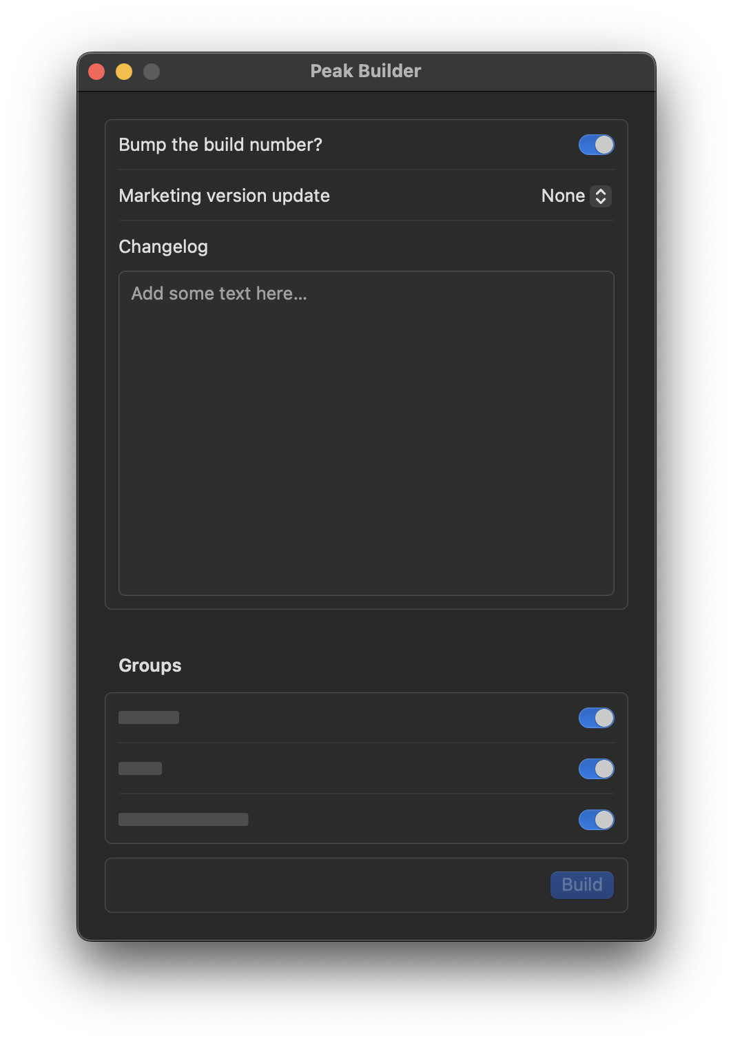
As soon as I started pushing the first builds of the app up to TestFlight, I realised the upload process was way too finicky for me to go through with regularly. Archiving and waiting for that to complete, uploading and waiting again for that to complete, waiting once more for processing, and then adding release notes and groups was a process that didn’t take much time in itself but was repetitive manual work that required me to sit around and wait for the computer to do it’s thing and intermittently hit a button or two before it continued. The answer there was an easy one: Fastlane. I’ve used it in projects but never set it up myself, and it ended up being a pretty quick and easy process.
With Fastlane set up, all I had to do was fire off a build once with all the requisite input and it would handle all the steps for me. This was a lot faster, but it was still a bit annoying having to interact with all of this in via the command line. I didn’t like having to remember the correct syntax and making sure I added all the parameters every time.
Enter Peak Builder: A SwiftUI app that handles the command line syntax for me. It displays a standard macOS form UI for all the fields. When I click build, it run some AppleScript that opens Terminal, sets the current directory, and executes the Fastlane command to cut a new build with all the correct parameters.
At all of 160 lines that took me a half hour to put together, I think this might be one of the biggest time savers across the entire project. And if or when I do start using a CI provider, those generally tend to offer webhooks too, so I should be able to just reuse all the same code.
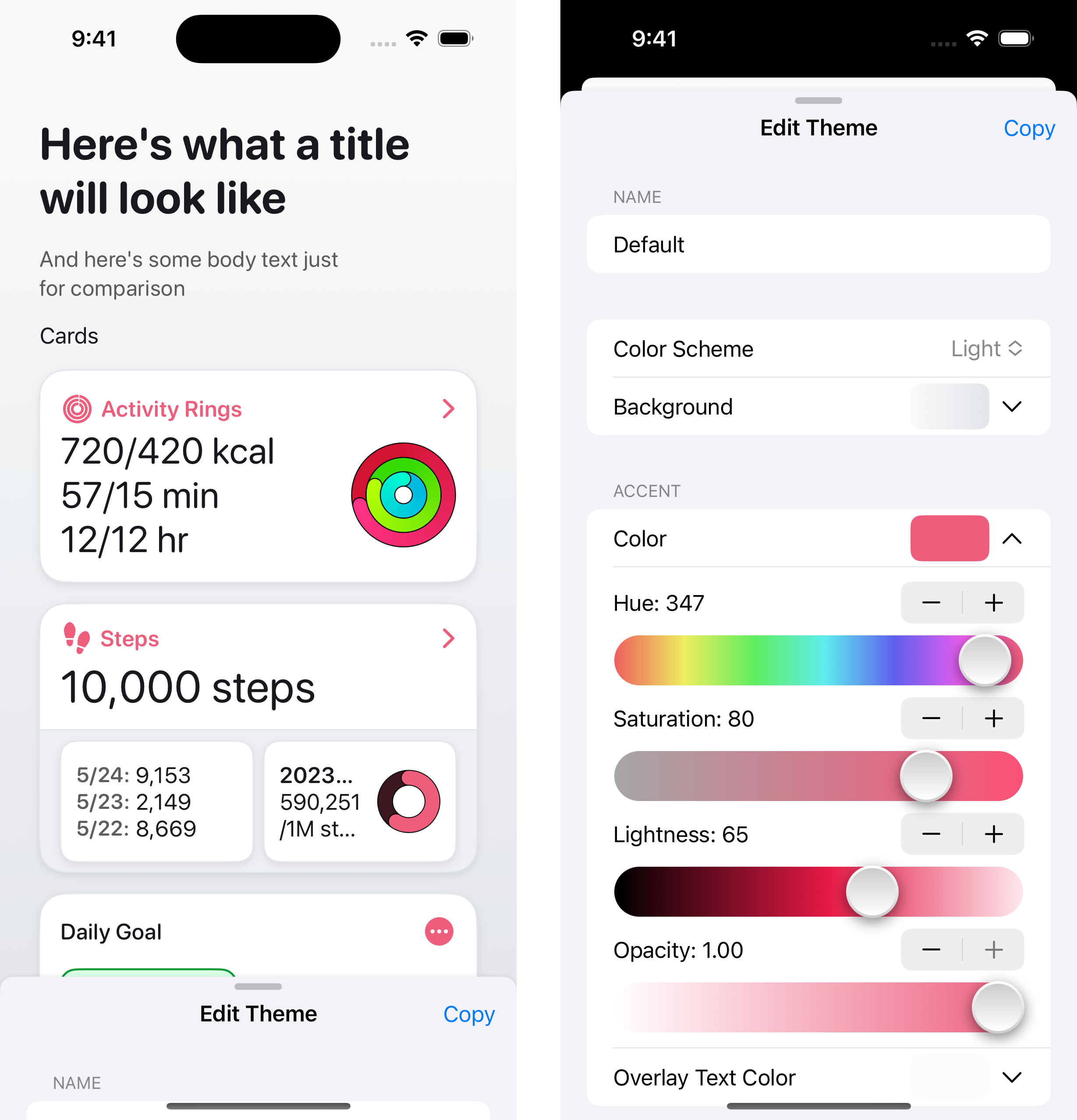
PeakThemer
Like with most other UI in the app, I started out designing themes right in Xcode, using SwiftUI previews. It was pleasant and fast enough to begin with, but I started noting some discrepancies when I’d run them on device. For some reason, colours that looked just right on the Mac felt incongruous on my iPhone, and would need a whole bunch of tweaking to work as expected.
I’ve never quite figured out what the issue was here, whether it was something related to Xcode, or just related to the display technologies (OLED on the iPhone vs. Mini LED on the MacBook), or something else entirely, but it became clear that this wasn’t a sustainable development cycle.
I needed to be able to make themes right on the device, and so I put together a simple little iOS app that lets me edit themes right on device using sliders. It shows a preview of what the theme looks right there, and also lets me copy the Swift representation of the generated Theme with a tap.
PeakSnapshotter
As I began the push towards launch, I realised there were gonna be a lot of screenshots and images to generate for promo art and App Store screenshots. I know my way around Sketch and so I knew this wouldn’t be too big an issue.
However I also knew that I’d also need to keep these updated, and at some point later on, localise them to multiple languages too. Moreover because the app was designed almost entirely right in Xcode, I didn’t even have designs to use as a starting point. Recreating all of my existing UI just for the purpose of screenshots seemed pointless. I could take screenshots of the live app and use those in Sketch, however at that point I might as well cut out the middleman and render the extra device bezels and promo text right in code too. And so that’s what I did.
I set up an app exclusively for testing which uses Point-Free’s Snapshot Testing library to capture and automatically diff images. The UI you see across all screenshots and promo art is using the same exact components the app uses for the most part2.
This setup has numerous benefits. As I update and iterate on the UI of the app, all my screenshots also update, without any work on my part. Updating screenshots to use a different theme takes just a single line of code. I also get to share the templates used across previews in code too, so I can update all screenshots in one shot, and the localisation work can also be unified with that for the rest of the app.
It does have the drawback that I can’t use fancy 3D device mockups, but that’s something I’m okay with.
That was a short look at how Peak was made!
There’s no way I could’ve covered my experience using SwiftUI and TCA in this post without it being an order of magnitude longer, but I’m hoping to write separate posts about those in time as well. If there’s anything else that you’d like me to write about, or just any questions you have about the app, feel free to contact me.
And also don’t forget to download Peak on the App Store, and let me know what you think about it.
- I haven’t been able to place why, but apps that look extremely stock often feel sterile on iOS, but at the same time they feel just right on macOS, and it’s apps that deviate from the system style that start feeling awkward. I’m very curious about which way things land for visionOS; having not tried it yet I’d guess it ends up being somewhere in the middle, though closer to macOS than iOS.↩
- Widgets on iOS use different typography metrics compared to the rest of the app itself. All fonts are smaller in widgets, but not proportionally so, and as they’re fairly simple bits of UI I decided to just remake those from scratch for the purpose of screenshots.↩