I like to break down my work on side projects into two phases. Once I’ve decided what features I want to focus on for the next few weeks, first I’ll just hammer away at the concept, making sure all the infrastructure is in place and solid albeit rendered in a sketchy interface just to make sure it all works, and then I like to take a week or two after that to polish and buff it out, making sure it’s pleasant to use as well.
I’ve been on an extended version of one of the latter stages recently, adding a bunch of much missed niceties to an app I’m hoping to release early next year, when I ran into some weird behaviour.
One of the little touches I was adding called for adding a little rotation to some views, sometimes. Nothing much, just a single degree’s worth1. But I noticed something weird seemed to be happening to the layouts when I did so. It’s a bit tricky to describe, so let me save a couple thousand words and show you an example instead.
One of the views whose layout was breaking is a custom PhotosStylePicker view. As the name suggests, it’s a Picker that attempts to replicate the look and feel of the one at the bottom of the Library tab in the Photos app. Here’s what it looks like:
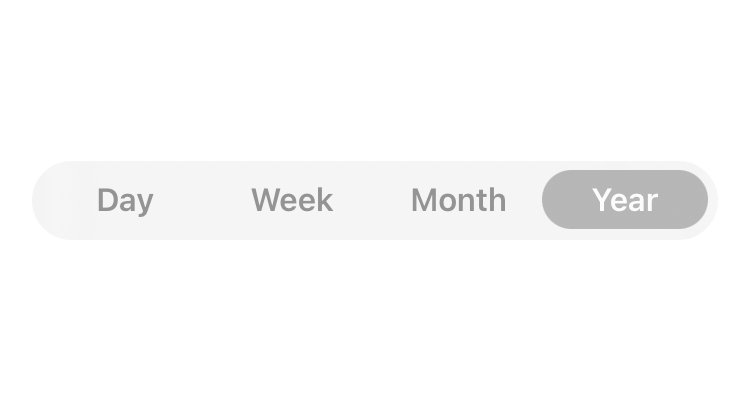
And now here’s what happenened when I applied a 10 degree rotation to it:
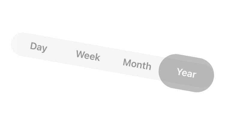
Not ideal. So what’s going on? Why is just the highlight broken there, and so strangely at that? I’ve posted the code for the whole view on GitHub, but here are the relevant bits.
// PhotosPickerStyle.body
HStack(spacing: 0) {
	ForEach(items, id: \.self) { item in
		Button(action: { selectedItem = item }) {
			Text(item.title.capitalized)
				.font(.callout.weight(.semibold))
				.lineLimit(1)
				.foregroundStyle(foregroundStyle(for: item))
				.environment(\.colorScheme, colorScheme(for: item))
				.padding(.horizontal)
				.padding(.vertical, 5)
				.frame(maxWidth: .infinity)
		}
		.buttonStyle(.plain)
		.anchorPreference(key: ItemFramesPreferenceKey.self, value: .bounds) {
			[ItemFrame(itemTitle: item.title, anchorBounds: $0)]
		}
	}
}
.backgroundPreferenceValue(ItemFramesPreferenceKey.self) { preferences in
	GeometryReader { proxy in
		if let anchorBounds = preferences.first(where: { $0.itemTitle == selectedItem.title })?.anchorBounds {
			let bounds = proxy[anchorBounds]
			Capsule()
				.fill(.thinMaterial.opacity(0.5))
				.environment(\.colorScheme, colorScheme.dual)
				.frame(width: bounds.width, height: bounds.height)
				.offset(x: bounds.minX, y: bounds.minY)
				.animation(.interactiveSpring(), value: selectedItem)
		}
	}
}
A quick summary of what’s going on here: I’m rendering an HStack with a Button for every item, using an anchorPreference to collect their frames, and then using a backgroundPreferenceValue modifier to display a Capsule matching the frame of the current selection.
Why go through all this trouble instead of just showing the capsule as a background for the selected button directly? Because this allows us to animate the position of the capsule as the selection changes, moving from the previous to the current selection instead of disappearing in one place and appearing at the other.
There isn’t much there to debug. First, I’m looking for the anchorBounds for the current selection from the preferences handed to me, converting it to a bounds CGRect using a GeometryProxy, and using that to set the frame of my selection capsule.
The anchor bounds are of the Anchor type, which is an opaque representation of a view’s frame that requires going through a GeometryProxy to obtain the frame relative to any given context. My code isn’t doing anything too complex with the frame which suggests that something in the conversion using the GeometryProxy has gone awry.
There isn’t much info to go by here in the documentation. GeometryProxy has very minimal API, two properties for the size and safeAreaInsets, the aforementioned anchor subscript, and a frame(in:) function, which lets you calculate the frame of the GeometryReader in any coordinate space. It’s likely that the frame(in:) function and anchor conversion both use the same mechanism under the hood too.
To test an assumption I set up a little Playground. In it, I’m showing a GeometryReader on screen, with a fixed size of 400 points, and using the frame(in:) method to print a frame in both the local and global coordinate spaces.
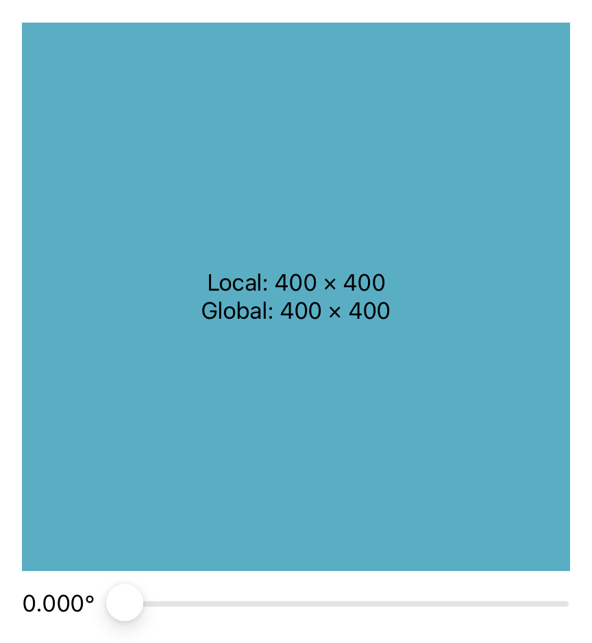
Initially, it starts off showing showing a square 400 point frame. As you apply rotation however, things start to change:
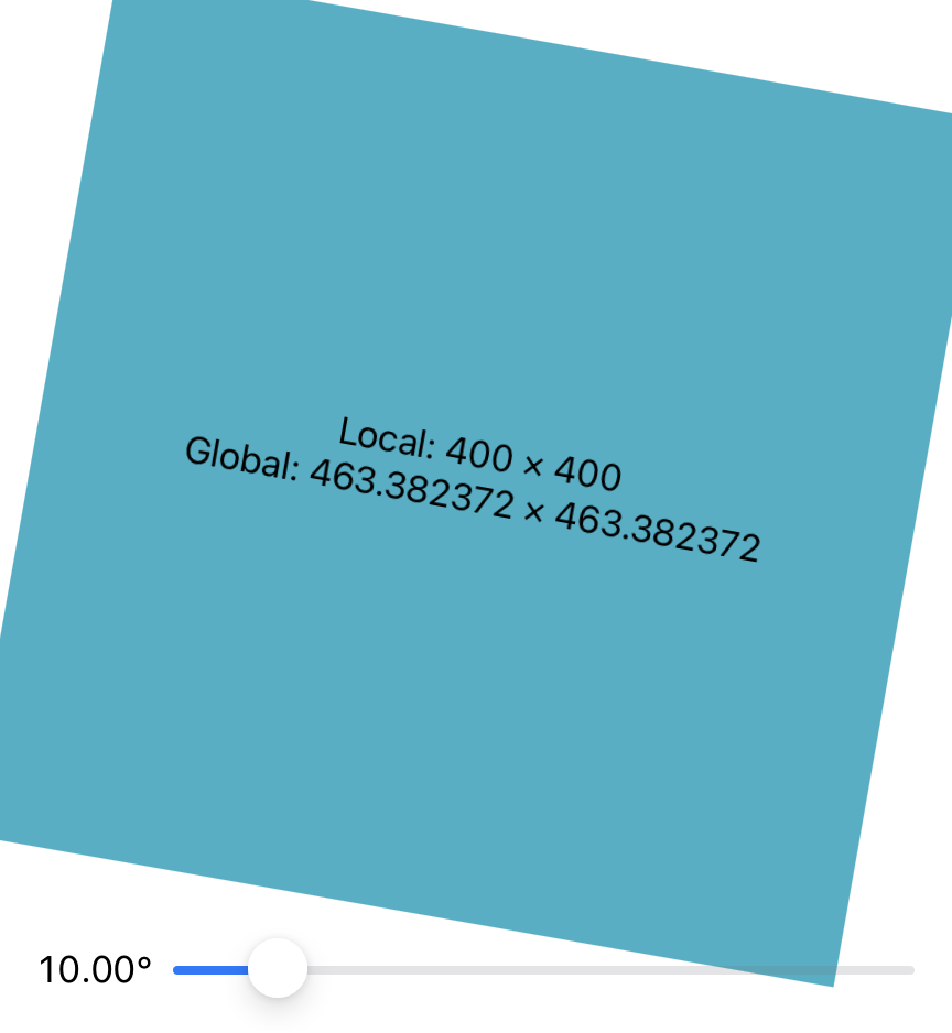
As you can see, the global frame now no longer matches the local frame, but instead reads 463 points. That’s not the size of the square, but as some basic maths confirms2, it’s the size of the bounding box of the transformed square. This lines up with what we were seeing above for the selection capsule as well, which was being rendered with a larger frame on applying a rotation.
So for whatever reason, applying a rotation seems to change how the GeometryProxy converts frames across coordinate spaces. This is a really strange behaviour, especially if you, like me, have come from the UIKit world where transforms do not affect layout3.
But the good thing is that since we know the bug, we know how we can work around it.
The Workaround
Since the bug happens when converting between the untransformed global and the rotated local coordinate spaces, we can work around this by just relying on a coordinate space that gets rotated whenever our view does.
The local coordinate space is far too narrow as it only computes frames with respect to the view it’s used in, and thus the origin will always be zero. But SwiftUI does let us construct our own coordinate spaces too, and so we can construct one that’s local to our view, ensuring that any rotations also transform our custom coordinate space, which means that for the sake of our frame calculations, there is no transform applied.
Here’s what the picker code looks like now:
// PhotosStylePicker.body
HStack(spacing: 0) {
	ForEach(items, id: \.self) { item in
		Button(action: { selectedItem = item }) {
			Text(item.title.capitalized)
				.font(.callout.weight(.semibold))
				.lineLimit(1)
				.foregroundStyle(foregroundStyle(for: item))
				.environment(\.colorScheme, colorScheme(for: item))
				.padding(.horizontal)
				.padding(.vertical, 5)
				.frame(maxWidth: .infinity)
		}
		.buttonStyle(.plain)
		.onFrameChange(in: .named(coordinateSpaceName)) {
			frames[item] = $0
		}
	}
}
.background {
	if let frame = frames[selectedItem] {
		Capsule()
			.fill(.thinMaterial.opacity(0.5))
			.environment(\.colorScheme, colorScheme.dual)
			.frame(width: frame.size.width, height: frame.size.height)
			.position(CGPoint(x: frame.midX, y: frame.midY))
			.animation(.interactiveSpring(), value: selectedItem)
	}
}
.coordinateSpace(name: coordinateSpaceName)
We can’t use anchor preferences anymore because it seems to always rely on the global coordinate space for conversions, but we can use regular GeometryReaders with the frame(in:) method. The onFrameChange(in:perform) there is a custom modifier I cooked up that just uses a GeometryReader under the hood to notify us whenever a view’s frame changes with respect to any coordinate space. Here’s what that looks like:
struct FrameKey: PreferenceKey {
	static var defaultValue: CGRect { .zero }

	static func reduce(value: inout CGRect, nextValue: () -> CGRect) {
		value = nextValue()
	}
}

public extension View {
	func onFrameChange(
		in coordinateSpace: CoordinateSpace,
		perform onChange: @escaping (CGRect) -> ()
	) -> some View {
		overlay {
			GeometryReader { proxy in
				Color.clear.preference(
					key: FrameKey.self,
					value: proxy.frame(in: coordinateSpace)
				)
			}
			.onPreferenceChange(FrameKey.self, perform: onChange)
		}
	}
}
And here’s what the picker itself looks like, with a rotation applied.
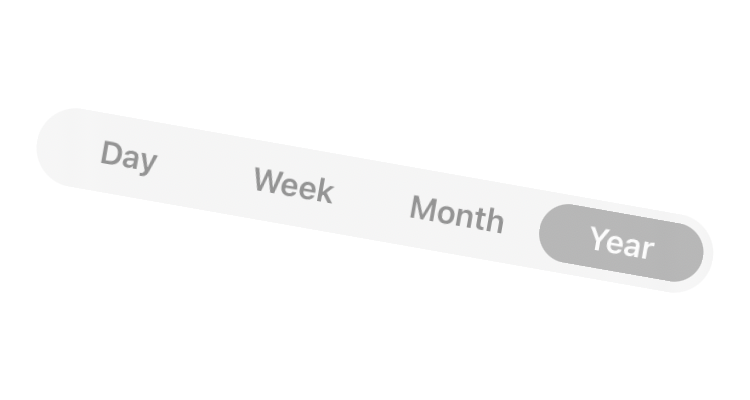
Problem solved, day saved, crises averted, right? Well, not so fast.
Turns Out…
While we can use avoid anchor preferences and the global coordinate space to avoid this rotation effect bug/behaviour/feature in our code, we can’t really do much about it for views we import.
One such example I mentioned above was Swift Charts. It seems to be using anchor preferences to orient its axis marks, which get a similar wonky layout.
As I was wondering how I could possibly work around this, even considering the possibility of rewriting a significant chunk of the app that relies quite heavily on Swift Charts, I got a reply on Mastodon from Erik Horacek:
@harshil try calling modifier(
_RotationEffect(angle:) .ignoredByLayout()), _RotationEffect is a frozen public type so you should be fine to use it!
I tried that, and it actually fixes the bug. My original code, Swift Charts, etc. all render completely fine now.
I didn’t mention it so far but I was also seeing a similar wonky layout from applying a scaleEffect. That too has an equivalent _ScaleEffect(scale:).ignoredByLayout() modifier that keeps layout working as expected.
For those afraid about using an underscored property, note that they are frozen and thus reliable, and ignoredByLayout() is public API too. You can even wrap it up into a custom modifier if you don’t want to be using underscored code that doesn’t show up in autocomplete, you can package it up into a custom modifier like so:
extension View {
	func rotationEffectIgnoringLayout(angle: Angle, anchor: UnitPoint = .center) -> some View {
		self.modifier(_RotationEffect(angle: angle, anchor: anchor).ignoredByLayout())
	}
}
I’m was originally still a bit wary of anchorPreferences when I first stumbled across this behaviour, but I haven’t found any other issues apart from these two modifiers. If you’re vending components built with it though, either internally or externally, it might be worth adding a note about this behaviour and the modifier above in case your clients run into similar issues.
I’m not quite sure why transforms affecting layout is the default behaviour, or why the default modifier doesn’t have a way to opt out of it, but the workarounds are all build using API available all the way since the introduction of SwiftUI since iOS 13, so they feel reliable enough for my use.
I’ve filed radar feedback FB11882239 regarding this issue, so here’s hoping we get some better public APIs for this issue in the future.
- What sort of effect can one achieve with just a single degree of rotation? That is left as an exercise to the reader.↩
- 400 * (cos(10) + sin(10))↩
- Well... except in the case of safe area that is. For some reason, if you apply a transform on a view, its
safeAreaInsetsare recalculated with respect to its final presented frame. You can work around this by setting the transform for its layer instead.↩