There’s an annual tradition in Apple developer and blogger circles where people will publish wishlists of things they’d like to see at WWDC.
The problem is these are often published in the weeks or even days leading up to the conference, which means there isn’t enough time for anyone at the company to read one and go “Oh hey that’s a neat idea, maybe we should do that”.
Meanwhile iOS 27 and the rest of this year’s OS updates have just been released, which presumably means that somewhere in Cupertino, someone is staring at a whiteboard trying to hammer out what iOS 28 and friends are going to look like. So this year I’m getting my wishlist in early. Maybe someone will actually read it.
So, in no particular order:
So What’s the Deal with SwiftUI?
When Apple announced SwiftUI, it was nothing short of a revelation. A brand new declarative framework that lets you write software for all of Apple’s OSes with one single API? Sign me up! At one point Apple even went so far as to call it the best way to build apps for their platforms. A lot of time has passed since then though1, and a lot has changed, and at the same time though, a lot hasn’t.
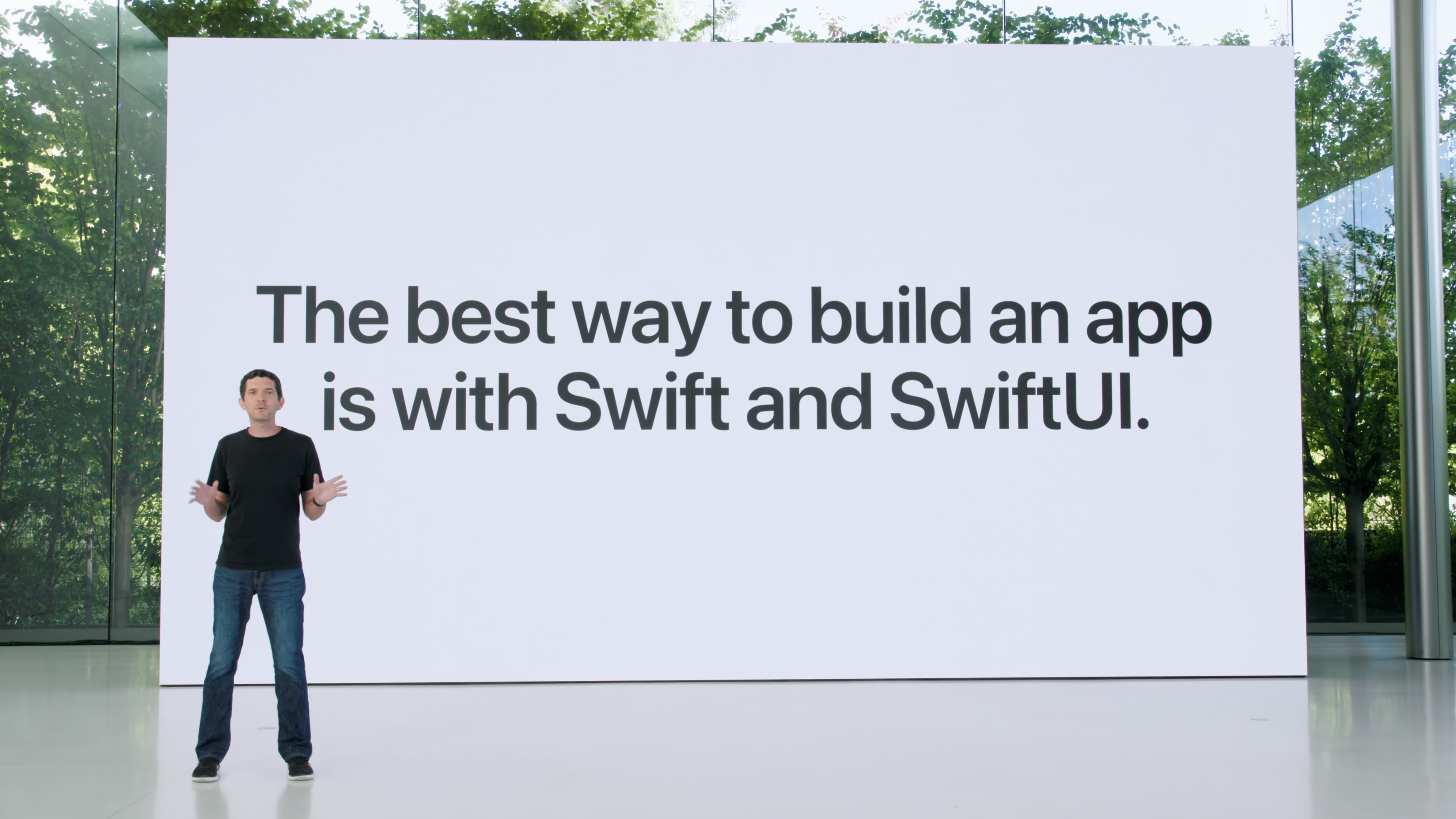
I think a fair characterisation of SwiftUI’s early releases is that it was easier and faster to build certain interfaces with it, but they might not be as performant or customisable as UIKit. I think it’s also fair to say that that characterisation remains true to this day. SwiftUI has broadened it’s arsenal of graphics APIs with things like shaders and charts, but when it comes to building containers, displaying massive collections of data, and custom layouts2, UIKit still remains streets ahead.
The biggest change though is the rise of LLMs and assisted programming. That quote above was from a presentation before ChatGPT’s debut. SwiftUI’s terse syntax which allows you to elide a lot of boilerplate becomes a lot less important when your code is being generated by an agent.
I still don’t really know what Apple thinks the long-term relationship between SwiftUI and UIKit is supposed to be. I don’t expect UIKit to disappear, and I also don’t expect SwiftUI to disappear. Apple seems to treat both equally when it comes to new development—the new APIs for iPhone Duo, for example, seem to be at par in both frameworks. SwiftUI is also fundamental to many recent bets, like widgets and shortcuts3.
So what’s the plan here? Are we just going to be building apps with these two interwoven frameworks for the foreseeable future? I’d really love some clarity here.
Searchable History
I feel like it’s a fairly common experience to want to find something—it could be a product website that looked interesting, a recommendation a friend sent you, a YouTube video that suddenly became very compelling in the half second between hitting refresh on the homepage and the site reloading, etc.—that that you came across recently.
On the web, you can sometimes find your way back to these places thanks to the magic of your browser storing your browsing history. But when you’re dealing with apps, it’s just a lot harder. It would be nice if you could search or perhaps even see a timeline of things you’ve looked at recently. The onscreen awareness APIs already seem perfect for this, and Apple’s even playing with a similar feature but for the real world with Live Rewind on the new Apple Watches.
Better Context Switching
This is somewhat a continuation of the previous point. Safari offers tab groups to organise your browser windows and tabs, and profiles to completely separate your browser usage and history for different use cases. While the core idea here is helping with organisation, it also allows you to context switch between these use cases a lot faster.
This, once again, is not the case when you’re dealing with apps. Stage manager, spaces, mission control, etc. are great for organising your active apps and windows, but when you want to switch between one set of apps and another based on the task at hand, there are no features that help you save your current configuration or jump back to a previous one. It would be really nice for there to be a first-party way to create and manage workspaces you can switch between with ease.
Device-to-Device Sync
It seems a bit strange that when I return home from a long trip and want to view the photos and videos I took on my computer, I need to wait for them to complete a round trip across the internet, bouncing off a data centre somewhere, and limited by the speed of my internet connection.
I know what you’re thinking, “Harshil, you can just AirDrop the files and get them over much faster”. I know, but then again, why can’t my computer do that by itself? Sync is a difficult engineering problem, and technologies like CRDTs are still in their early days, so this is perhaps a big ask even in the best of times. But I’d love to see Apple try.
Recent Photos Permissions
I really liked the concept of sharing limited photo library access when Apple introduced it in iOS 14, but in practise I almost never used it. Manually selecting photos for every app and then granting it permissions again for new ones as you take them gets tedious very fast.
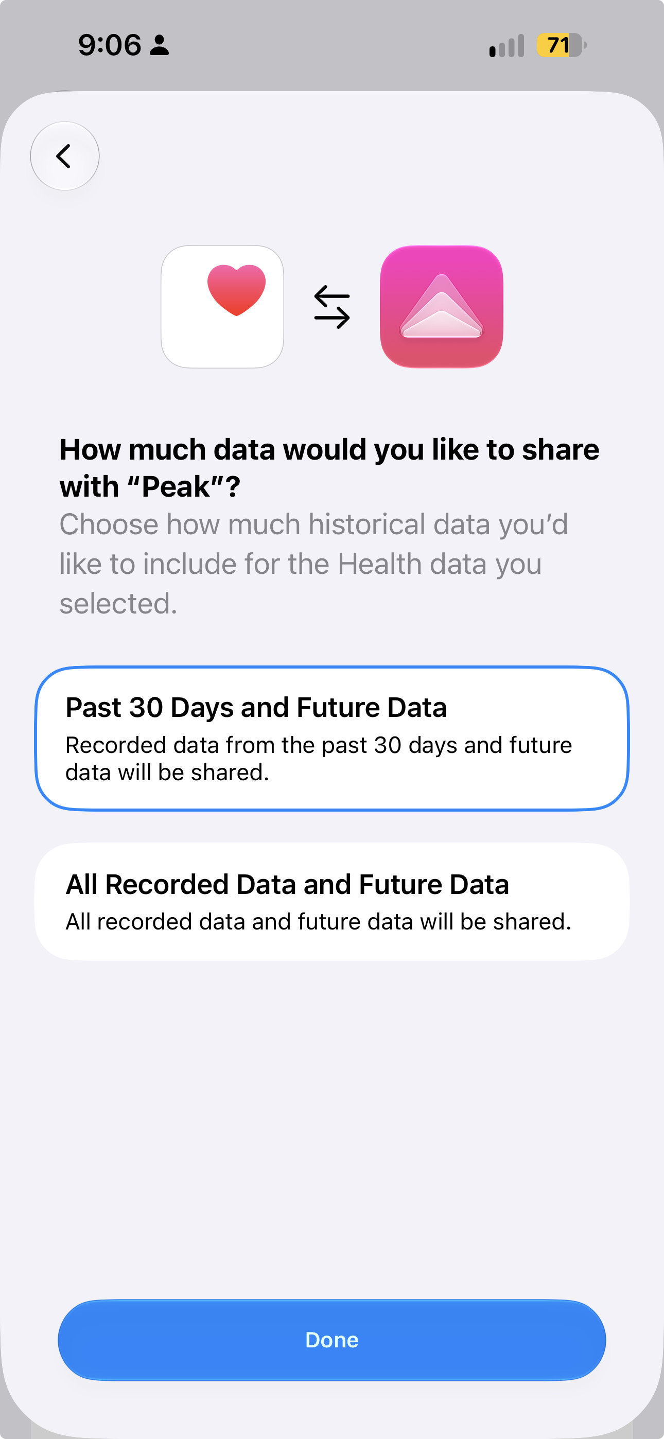
I’d love to instead be able to just let an app access photos from say the past week or month. Apple introduced exactly this for HealthKit in iOS 27, where users can choose between giving an app access to all of their data, or only the data from the past month.
But also, if you’re building an app, please just use the PhotosPicker and save us all some trouble.
Actually Clear Liquid Glass
Some Liquid Glass controls like tab bars and pickers and the iOS lockscreen have this wonderful appearance where the center is clear and you can see refraction and specular highlights on the edges.
The Liquid Glass APIs have a regular, more frosted style, and a clear style. You might think that the latter is what’s used to drive the aforementioned effect, but you would be wrong. I’d just really love a first-party API for a truly clear glass effect.
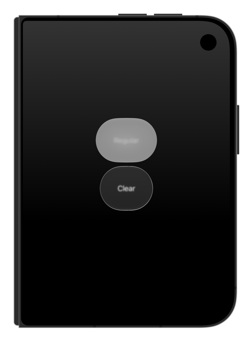
clearish would be more accurate naming here
Updated Typography (Maybe, IDK)
I’m a huge fan of Apple’s San Francisco font. It feels so much more “right” for the OS than Helvetica and Lucida Grande before it (let us not even talk about the brief nightmare that was Helvetica Neue), and so this is the most “ehhh I’m not that sure” item on this list.
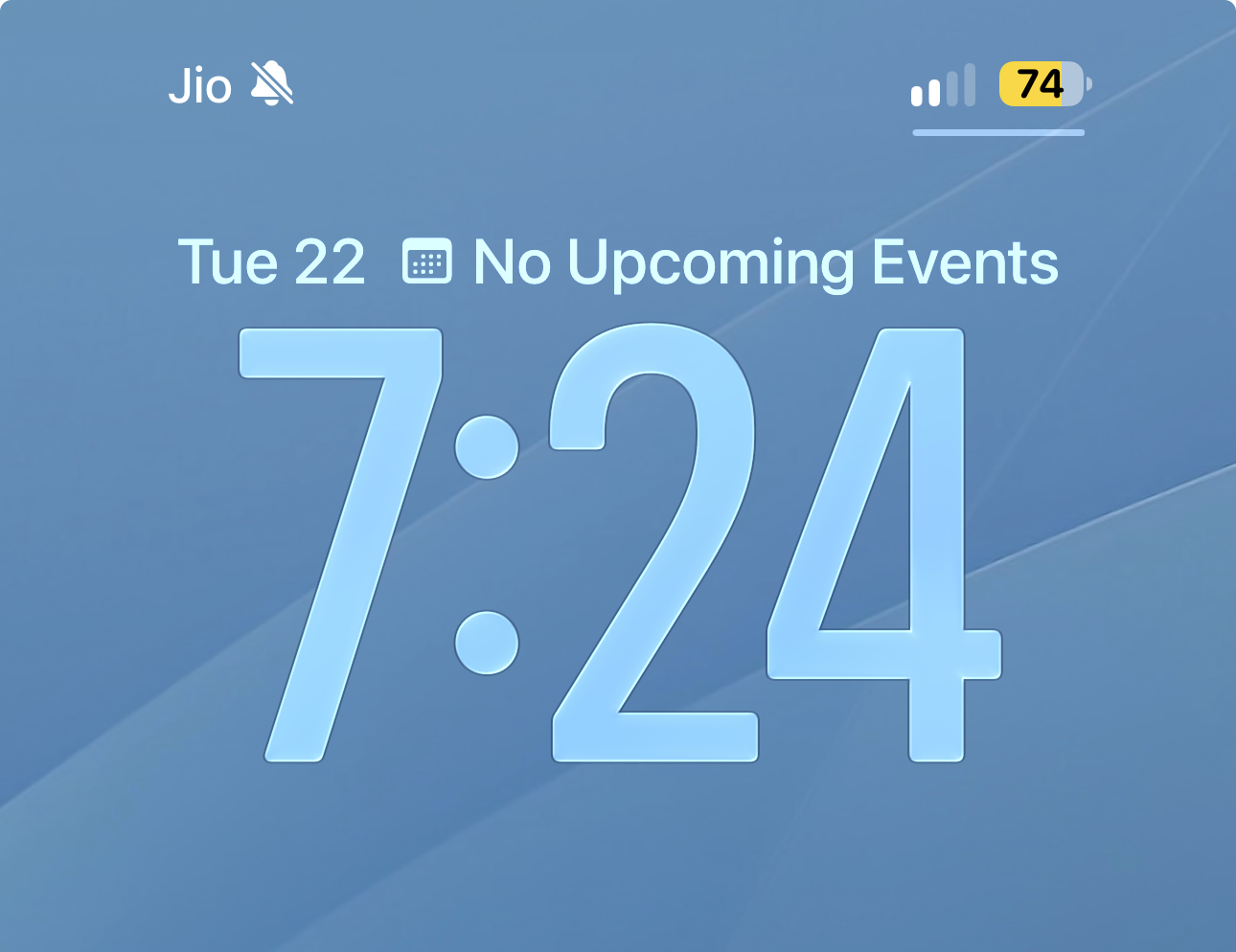
With iOS 26, Liquid Glass, and the even more rounded, circular aesthetic for pretty much all UI across platforms now, I do wonder if it’s maybe time for a slightly tweaked font. And turns out there’s a good candidate for this already: SF Soft. It’s basically SF, but with slightly softer edges. The name might sound strange, but you’re probably no stranger to this font: It’s the default font for the time on your iPhone’s lockscreen.
Global Search in Music
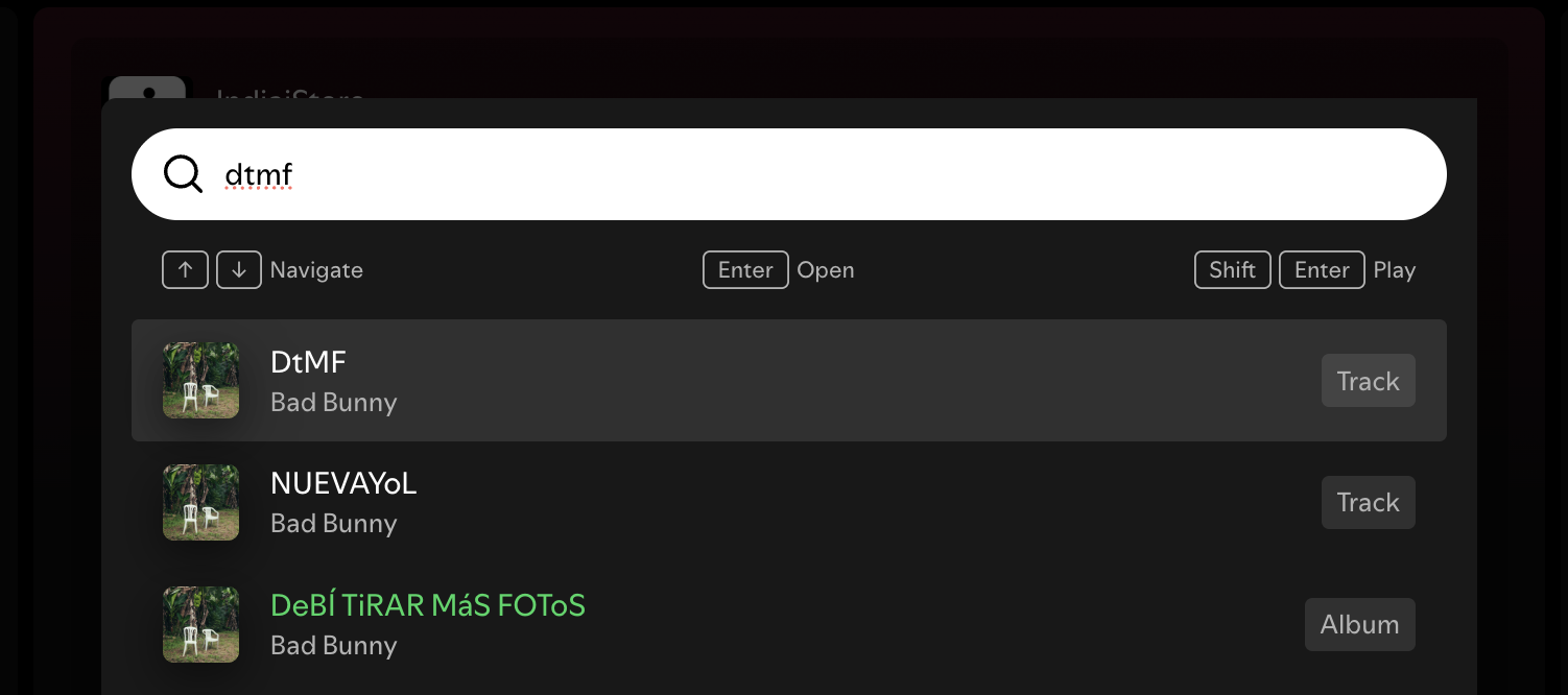
“Command Palettes” are all the rage in macOS UI design of late. If you don’t know what these are, they’re kinda like an app-specific version of Spotlight, where you can use a keyboard shortcut to invoke a text field which can be used to search for things and/or quickly run actions.
As a recent convert from Spotify to Apple Music, this is one of the features I miss most. You can press Cmd + K in Spotify and it’ll show a search field. With a few taps you can search for an artist, song, album etc., and either navigate to it or hit play, all right from the keyboard, without leaving the context of whatever you were looking at.
Apple Music’s search, meanwhile, involves switching to a different tab (using your pointer; there’s no keyboard shortcut), typing out your query, and then navigating to the page for the artist/song/album/etc. in order to hit play.
Camera App Redesign
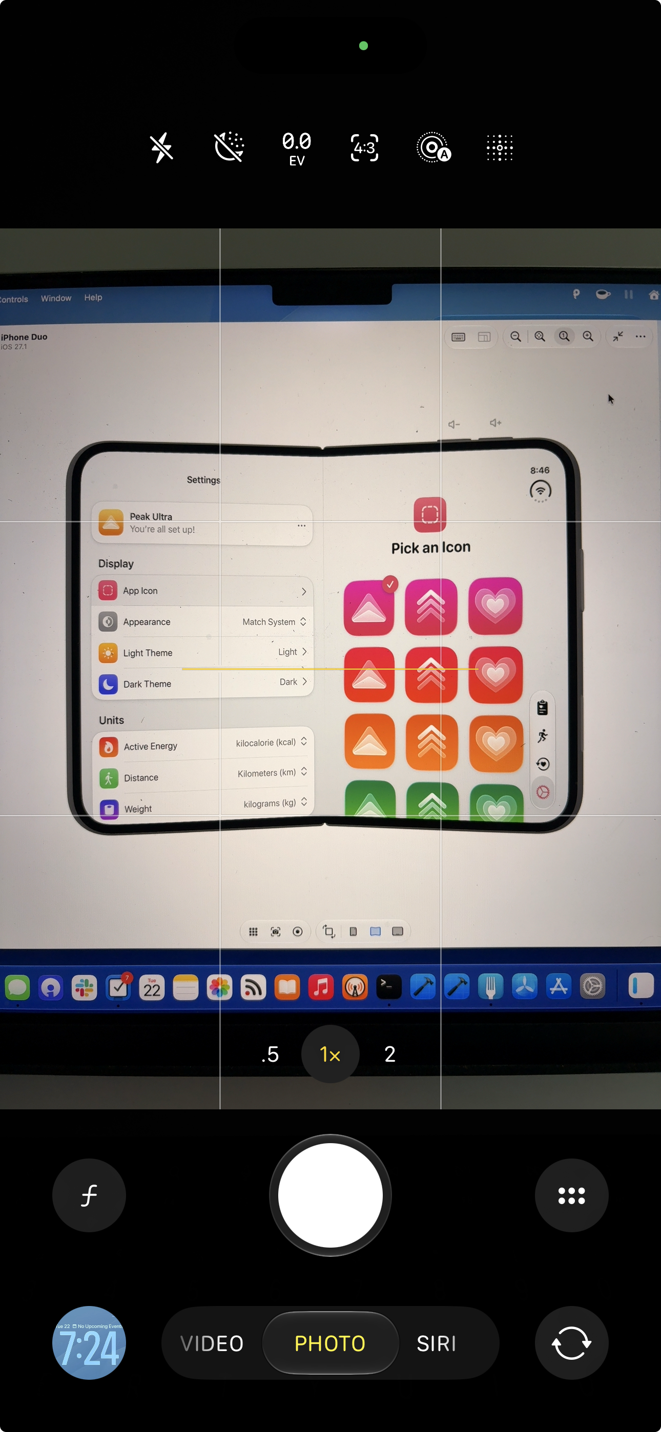
iOS 27 finally lets you pick which controls are important for you and pin them for easy access, but in practise, it’s a very perplexing UI design.
For some reason though, these pinned controls appear at the very top of the display, far away from where your thumb is. It’s much faster to reach the full list of controls4 which almost defeats the purpose. They controls also display very oddly, just clumped up together with no spacing between them.
Also, while I somewhat understand not bringing flagship features like Photographic Styles 3 to older devices, it feels very stingy to reserve basic controls like white balance for the latest and greatest. Manual camera APIs have allowed 3rd-party apps to display these controls since iOS 8. That’s 12 years ago, and it ran on the iPhone 4S!
Better Filtering in Fitness+
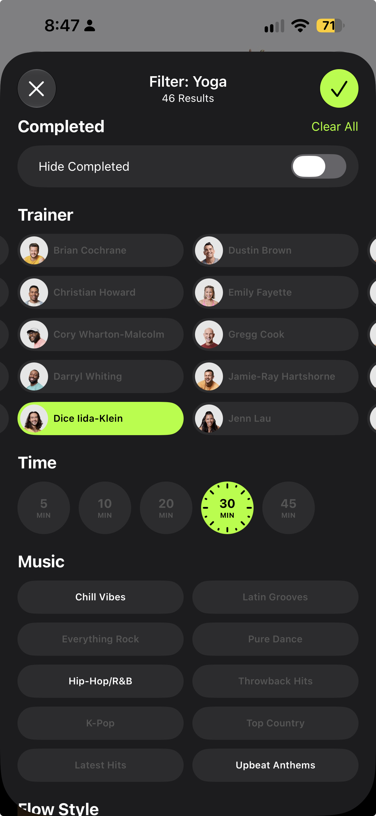
I’m a huge fan of Apple’s Fitness+ service for workouts, but its filtering UI has always puzzled me. Let’s say you want to do a yoga workout. You have some time so you’re okay with a longe workout, say 30 or 45 minutes long, and you want one led by either Jessica or Dice. You’d think you should be able to see just those workouts right? Nope. You can only select one duration and trainer at a time.
Even more bizarrely, the filtering UI also shows trainers from other workout types, people who have never led a yoga workout and thus can’t possibly be selected. This could use some work.
TestFlight Apps in App Library
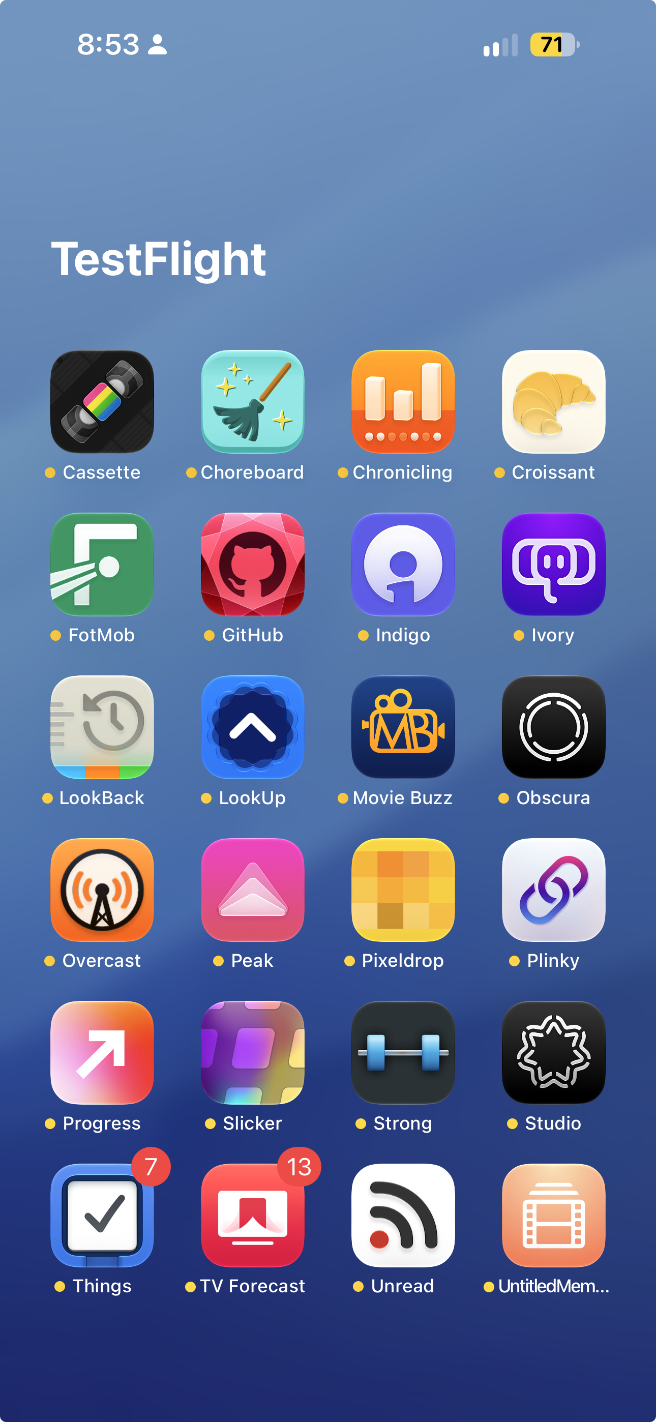
I like App Library a lot, I like TestFlight a lot, but I do not like the TestFlight folder in App Library. When you install an app from TestFlight, it’s yoinked from its category’s folder and moved to a TestFlight folder. I use the TestFlight versions of a lot of my daily drivers, which means that that folder is a rather bewildering assortment of apps.
If I go looking for Obscura, Overcast, or Things, they won’t be in the Creativity, Entertainment, or Productivity folders, but rather alongside each other. This feels very confusing and almost defeats the purpose of App Library for me. I don’t begrudge having a dedicated folder for all my TestFlight apps5, but it would be nice to also have those apps show up in the folder for their categories as well.
Xcode Should Keep My iPhone Awake While Building and Installing
It’s a daily occurrence for me that in the time it takes for Xcode to build and install my app on my phone, my phone has locked itself. It would just be neat if there was some way to not do that.
Apple Watch Faces API
Between the Apple Watch’s resource constraints, potential copyright issues, and Apple wanting to control the watch’s image, I don’t think this is ever coming. But as a wise man once said, you miss 100% of the shots you don’t take, so here it is.
And that's the list. Some of these are small asks. Some of them are moonshots.
Here’s hoping at least some of them come to pass come WWDC next year.
- That slide, from WWDC 2022, is closer to SwiftUI’s initial unveiling than today.↩
UICollectionViewmight honestly go down as the single greatest API Apple has ever shipped.↩- Both of which, in turn, seem to be foundational to Siri AI and rumoured upcoming products like the HomePad.↩
- There are even two way to do that: You can tap the grid button to the right of the shutter, or you can tap the current camera mode in the picker below it.↩
- Although then again, I can always just open the TestFlight app itself to see them in one list.↩